Graphing Mr. Lopez’s way.
- Get some graph paper, it makes everything so much easier, but if you are constructing this graph the night before its due and all stores are already closed you may do it the hard way.
- In this case you will at least need a ruler. If you don’t have this either, Good Luck.
- For the following graphs use a minimum of a half sheet of paper. This will allow you enough room to accurately plot your points. Small graphs where the points cannot be accurately determined will not be acceptable.
- Keep, independent and dependent variable in mind.
- Independent variable is the variable that is not dependent on the other. “Imagine that”
- Dependent variable is the variable is the variable that depends on the other. So does pressure depend on volume or does volume depend on pressure.
- The Independent variable is plotted on the X-axis (horizontal) and the dependent is plotted on the Y axis (vertical).
- Correct scale. This is pretty tough for some people to get, but is essential.
- The best way to explain correct scale is by example. Let say that we are graphing height versus age, and in the following table, data was taken.
Age Ht.
|
1 |
1.5 |
|
2 |
2.0 |
|
5 |
3.0 |
|
8 |
4.0 |
|
12 |
5.0 |
|
15 |
5.5 |
|
18 |
5.6 |
|
30 |
5.6 |
- Determine the highest of each of the variables. In this case 30 for age and 5.6 for height. Since 5.6 is not a whole number we can round up to 6.
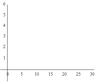
- Construct the x and y axis, whether it is on graph paper or using a ruler. Age will be placed on the x axis since it is independent and height will be placed on the y axis since it depends on the age.
- Determine the interval you will use to reach each of the highest variables.
- Notice that I used intervals of 5 for the age and intervals of 1 for height. I could have used intervals of 1 for age, but it would have placed quite a few numbers to close together.
- One common mistake is that people tend to get a little lazy and just use the numbers from the data as the interval.
- One
other common mistake the space between each of the intervals is not the
same. If you are not using graph paper, use a ruler to make sure the
distance between each interval is the same, and don’t forget that 0 is a
number so the space between 0 and 5 should be the same as 5 and 10
 .
.
- At this point just plot your points.
- Always use straight lines. Use a straight edge or ruler whenever a line needs to be drawn. Never free hand lines.
- Lastly Label everything: X axis, Y axis, slope, etc.